Chapter 21
Building a Responsive Web Design
In This Chapter
 Setting the Stage by percent
Applying layout defaults and layout presets for responsive web design
Combining different elements
Previewing on mobile devices through your browser
This chapter discusses the details of formatting settings for a responsive web design. By using percentages (%) instead of pixels (px), you can create animations that automatically adjust to the size of a person’s browser. Using percent also helps with formatting for different mobile screen sizes for devices such as phones and tablets.
Currently, popular mobile screen sizes range from 4 inches to 7 inches to 10 inches. Creating a separate animation for each type of device is not necessary. Instead, you can create a responsive web design as discussed in this chapter.
Starting at the Stage
To get started with creating a responsive web design, you need to set the width and height properties of the Stage to %.
You can also set the properties for maximum width and minimum width:
 For the minimum width, you can use either % or px.
You can set the Max W property to none, px, or %. The default is None.
To change the Max W property, click the drop-down arrow and then uncheck the None box, shown in Figure 21-1.
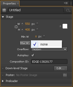
Figure 21-1: Change the Max W property by clicking the drop-down arrow.
When you change the W and H properties from px to %, little white icons (ticks) appear on the Ruler, as shown in Figure 21-2. You can slide those ticks up and down the Ruler to simulate the effect of a person adjusting the browser’s window size.
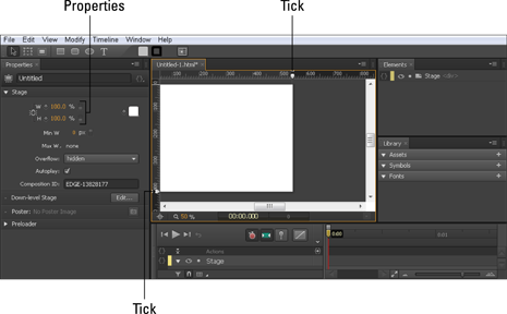
Figure 21-2: Change the Width and Height properties to % to enable browser-resizing simulation.
If you have elements on the Stage that are also set to %, you see those elements adjust in size as the browser window is resized.
To test the width percentage settings for your design, experiment by using px instead of % for the minimum width:
1. Start a new project and set the Stage width and height to 100%.
2. Set the Min W to 600 px and leave Max W at None.
3. Import an image and place it on the Stage.
4. Set the image width and height to %.
5. Slide the tick down the ruler and watch as the image resizes.
When you slide the tick past the minimum width, the image and Stage stop scaling down in size. If you preview this in a browser, you’ll see that the image becomes cropped when you size the browser smaller than the minimum.
 The little caret (shown in Figure 21-3) that appears in the Ruler indicates the px width of the Stage when you use the percent setting.
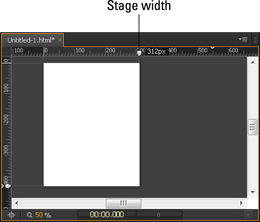
Figure 21-3: The caret indicates the Stage size in px.
Setting the Layouts
You can apply the same percentage settings to elements for a responsive web design as you can for the Stage. You can set these properties a few ways. One way is to change the properties from pixel to percentage for each element individually from the Properties panel. However, that option can be time-consuming, and it isn’t necessary. Adobe Edge Animate CC provides two different means for setting global parameters: layout defaults and layout preferences. The layout preferences are geared toward scaling and sizing for each individual element in relation to the parent element. The layout defaults set the value for each element as either percent or pixel.
Set the layout defaults first and then override them as necessary with the layout presets.
Although the terms layout defaults and layout preferences may sound similar, they have different meanings, as I explain in the following sections. I cover the layout preferences in more detail in Chapter 8.
Using the layout defaults for responsive design
If you know that you want to use the same settings for all the elements and images that you use on the Stage, you can set the layout default values, as shown in Figure 21-4. You can open the Layout Defaults menu from the toolbar.
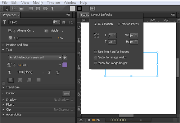
Figure 21-4: Go to the toolbar to open the Layout Defaults menu.
For a responsive web design, you can use a combination of px and % settings, depending on what you want to dynamically resize and what you want to be static.
To start off designing for responsiveness, I recommend the following settings:
Set all of your elements to % (L, T, W, and H).
Select the Use ‘img’ Tag for Images box.
Select ‘auto’ for Image Height.
Changing the layout defaults to percentages sets the properties for all elements — text boxes, rectangles, ellipses, and images — to respond when the browser window is resized.
To keep your image size proportional (so that it doesn’t stretch oddly wide or long) when the browser is resized, set either the image width or the image height to Auto (use the check boxes shown in Figure 21-4 to configure your settings), but not both — nor neither one. You have to set either the width or the height to Auto to keep the image proportional as the window is resized (refer to Figure 21-4). The exception to this is when you work with SVG files (for example, an image of a pattern). In this case, you can set both width and height to %, and the image will still look good.
If you set your elements for percent, when you resize the Stage, the elements on the Stage also resize:
To stop elements from resizing when you change the size of the Stage, change all the elements back to px.
Using the layout preferences for a responsive web design
Chapter 8 covers the details on the layout preferences, which you can find in the Properties panel, as shown in Figure 21-5.
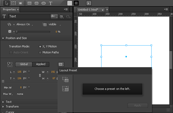
Figure 21-5: Use the layout presets from the Properties panel.
You can override the layout defaults that you configured from the toolbar with the layout presets from the Properties panel. This is useful if you want one of your elements to behave differently than the layout defaults.
A big difference between the layout defaults and the layout presets is that the presets are intended to work with parent elements:
Layout presets apply responsiveness to existing and/or multiple elements while layout defaults are for new compositions with no or few existing elements. In addition, the layout presets make it easier to apply certain responsive behavior such as scaling only the position, centering an image, and so on.
If the element is not nested inside another element, Edge Animate treats the Stage as the parent element.
Here’s a fun way to experiment with how the layout presets work:
1. Draw two elements on the Stage, such as a rectangle and an ellipse.
2. Nest one of the elements into the other (drag and drop one element into the other from the Elements panel).
3. Select both of the elements and set the Layout Preset to Scale Size (see Figure 21-6) and then click Apply.
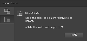
Figure 21-6: Select the Scale Size Layout Preset to resize the child element when the parent element is resized.
4. Select only the nested element and resize it.
The parent element should remain unaffected.
5. Select only the parent element and resize it.
The child element should resize along with the parent.
6. Select the Stage and resize that to watch the two different elements resize.
For the next step, make sure the Stage width and height are set to %.
7. Test the responsive web design aspect by dragging the tick mark along the ruler.
8. Change the layout preset for one of the elements from Scale Size to Scale Position (see Figure 21-7).
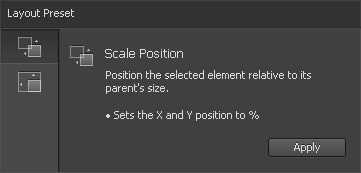
Figure 21-7: Select the Scale Position layout preset to affect the position of the element.
9. Drag the tick mark in the ruler and note the difference in behavior for the element.
 Elements do not have an auto feature like images do to keep proportions. If you want an element to maintain its width or height, you have to switch back to px rather than use %.
Testing Your Animation’s Responsiveness
The best way to find out how a responsive web design works is to test it before you start working on a real project. You can glean much from these experiments. For example, images can keep proportions, but drawn elements and text boxes do not if you use percentages instead of pixels. Also, drawn elements and text boxes won’t wrap around images if you resize the browser causing the window to shrink. Instead, drawn elements and text boxes resize to fit the new window dimensions — and either appear over the image or disappear under the image.
You can affect whether the elements appear over or under the image by using the Arrange setting (right-click an element and choose Arrange and then select whether you want to bring an element forward or backward). This is the same as changing the order in the Elements panel.
Adobe Edge Inspect
Adobe Edge Inspect, as the name implies, is part of the Edge suite of tools. This is a very handy Chrome extension that you install into both your Chrome browser and your mobile device. To download the Chrome extension, go to http://html.adobe.com/edge/inspect. You do need a membership to the Adobe Creative Cloud to install this extension, which is available for free (as of this writing).
You also need to install the Inspect app on your mobile device:
iOS devices: www.adobe.com/go/edgeinspect_ios
Android devices: www.adobe.com/go/edgeinspect_android
Kindle Fire devices: www.adobe.com/go/edgeinspect_amazon
For more information on installing, you can visit http://forums.adobe.com/docs/DOC-2535.
After you have both the extension and the app(s) installed on your devices, you can pair your computer with your mobile device, enabling you to see your computer’s browser. To enable the synching, you must have all of your devices on the same wireless network.
The synch is limited to only the browser. If you switch to your desktop, your mobile device continues to display whatever was last on your web browser.
If for some reason your computer and devices don’t automatically synch to each other, you have to manually input your computer’s IP address (when you click the Edge Inspect button in the browser, it shows you the IP address) into your mobile device. That’s what I had to do to pair my Windows laptop to my Android phone. I also had to do it for my Kindle Fire. And that’s when I learned that in order to pair up multiple devices, you need to pay a $9.99 per month membership.
The benefit to using Edge Inspect is that you can view your Edge Animate projects on your mobile device when you preview your animation in the browser. This means that you don’t have to upload your files to the web for testing. You also don’t have to type in the URL for your project over and over. In addition, if you click any links in the browser running on your desktop machine, then all synched devices will also follow that link as well. The savings in time alone may be worth that ten bucks per month.
To test how different types of elements react to the browser window resizing, try the following:
1. Set up the Stage for a responsive web design by setting the width and height to %.
2. Set the layout default to %.
3. Add different types of elements to the Stage, such as text boxes, images, and rectangles.
4. Set different layout presets for the different elements.
5. Nest some elements into each other.
6. Drag the tick on the Ruler around (both the vertical and the horizontal) and see how the different elements react.
You can also preview in a browser to see how the elements react when you resize the browser window.
You can also use Adobe Edge Inspect to view how your design looks on different types of devices. I discuss this in the Adobe Edge Inspect sidebar.